Tuesday, June 14, 2011

Couldn't resist

I altered the ice cream picture just a little. My friend mentioned that it would suit the summer theme if I added glasses. So I did, and it turned out to be pretty awesome.


In addition to that, I made one with silly faces. At least they're happy being eaten, right? Hopefully it warms up soon (and my cold disappears). I can't wait to devour the mint chocolate chip and cookies n' cream ice cream in my freezer!


Altered in: Adobe Illustrator CS3

First event in a while

The Medium Magazine launch party was yesterday (June 13, 2011). Even though it drizzled here and there, the party was an absolute success. It was a pleasure just being there, seeing everyone interact with one another with lively music playing int he back. The members of Oddly studios were hard at work! I was able to say hi to them every so often as they kept moving back and forth between the rooms!

Unfortunately, I was only able to capture a few shots with my digital camera. There was dim lighting and I had my hands full for most of the night. I managed to take a few pictures of the team members, but you'll have to catch pictures of the event on the Medium site.

I'll consider taking a better camera with me next time, of course. But I have to be able to look fancy and still carry a giant SLR around.


I also got all dressed up for the event as well. It's rare for me to wear dresses, but this one was comfy and pretty. Plus it was an awesome fashion event!

The picture was taken by Jesse using my Canon Camera. (Thanks, Jesse!)

Saturday, June 11, 2011

It's summer time!

I felt like ice cream because it's summer and it's gotten bloody hot this year (so far). Then I figured I'd vector a cute little ice cream banner/theme/logo (or whatever you would like to call it). It was actually very fun. I had to experiment with a few colours first before I was satisfied.


Vectored in: Adobe Illustrator CS3
Edited in: Adobe Photoshop CS3

Sunday, May 15, 2011

Second Fairy Vector

I did this one two months ago but didn't upload it until now. I like it the way it is but I'll add an extra spray of white in the background next time. Originally the sketch was really messy, but I was able to adjust the body shape with the anchor and vector points. The flower I made is the orange version of a second lotus vector I did a long time ago. It came out much better than I expected because I used gradients again.


Developed in Adobe Illustrator

Here are the original (super rough) sketches:

Saturday, April 16, 2011

More sculpting!

Yesterday I finished glossing the Audino figure I made for my friend as a birthday gift. This is my first time using paint-on-gloss, and I have to admit it isn't as nice as the spray on gloss my friend uses. I guess maybe it's because I'm not painting on enough layers. The texture's a bit funny too, but that might be normal.

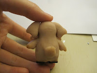
While she was in the oven, her feet got burnt. Pretty badly too. It's amazing how super sculpey will burn this badly in seven minutes. Thankfully paint can cover the damages.




Here is the coloured version of Audino. I'm very happy with the way the colours came out. It looks really sweet up close.

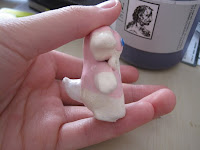
As you can see, paint really does save the day. Well, most of it anyway. Audino can't stand on its own due to its shape, so it needs to lean against something. I probably should have made a base for it...


Here is a picture of Audino


Disclaimer: I do not own Audino, nor did I design it. It is a creation made by Nintendo and Ken Sugimori.

Little bunny!

I finally managed to export the HD version of the 3Ds Max project I did in school in semester 3, which was about three months ago. I spent one week working on this project for my final assignment and boy did I have a blast. At first I wasn't sure what I really wanted to do, but eventually I decided I wanted to do something simple but cute. Since I learned about textures, I was able to apply them to all the background objects. So the bricks, the wood, and the cement all look a little more realistic. Also, the skylight really helped.

I think the hardest part was putting the bunny together. I had to put many shapes inside his body so I can attach all the limbs together and they would all move in fluid motion (whenever I needed, anyway). I am pleased to say I am very happy with the final result. It is short, but cute, and I enjoyed working on it very much.

Man, I love 3D!!

Thursday, March 31, 2011

Vectored myself

I wanted to vector myself for the "about" page of my website, which is currently in the process of being scripted/coded/developed. This is my first time vectoring a person and I'm quite pleased with the outcome. The colours came out better than I expected. I personally thought it was going to be somewhat difficult because of the way the sun was shining on me the original photo. I definitely had fun with it, even though vectoring the image took a few days. All of this was done in Adobe Illustrator using the pen tool.

Here is the vectored piece


Here is the original image


Sunday, February 13, 2011

Theta

Here are some designs from semester 2's typography class. The assignment was about hierarchy so I did three pieces that emphasized on the word theta, the symbol, and its definition. I'm only uploading two because these are the ones I really liked out of the three.

The first one emphasizes on the word "theta" rather than the symbol.

The symbol for theta is emphasized in the second one.

Sunday, January 16, 2011

Design Practice WIP

I wanted to practice designing website layouts (home pages, product pages, etc...) The first one that came to mind was flowers. The layout is meant to be quite basic since I didn't have too much time to work on it. The sidebar lacks more information but that requires some more research before it reaches completion. I'd probably extend it vertically and insert some more options and ads...but only if it looks nice.

Please make note that none of the floral images belong to me and they have only been used for practice. They are not used for sale and belong to their respective owners.

Friday, January 14, 2011

Shoe ad

Here is a shoe ad I did for photography class in semester 2. I had to take several pictures my shoes, so I could choose the best one to use for a fake poster/ad. I chose Aerosoles because I owned a pair of their shoes, which were still new (in my original box) and were very nice. The logo was hard to do at first, but I vectored half of the letters afterwards to match one I found on Google. I had to place in shadows of my own with a brush tool because I couldn't keep the shadows from the original photo.