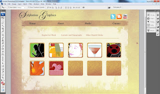
I think I'm going to change up my blog or update it, mainly because my current one is out of date and it's getting a tad wonky on me. I can't even have a regular compose/html post box...so yes, that is a sign for me to revamp! It will work out well since I'm already working on a new layout for my website. I'll go into 2012 with a bang!
I quite like the texture I used for my website because it's actually white tissue paper. I found a nice flat piece in the house and used my scanner to scan it. I adjusted the colour and added some effects on it and the result is wonderful.
The thumbnails for my works have a nice border around it. It's the same texture used for the background. The main white section is slightly faded and I used my grunge brushes to remove some sections from the sides. It has a nicer effect. At least to me it seems more interesting than plain shapes.
Most of the icons are set up now in css and html. I have some of the copy done for the about section and I believe I will be keeping what I originally had in my contact section from my previous layout.
Currently being designed in: Adobe Photoshop CS3
Additional pieces designed in: Adobe Illustrator CS3
Currently being built in: Adobe Dream Weaver CS3

